Fred Meyer Landing Page
When I first joined the Fred Meyer creative team, I received the opportunity to work on the Fred Meyer General Merchandise landing page. This is a small window into the innovative changes and solutions aimed at increasing customer engagement and encouraging in-store shopping.
Agency: Inspired Thinking Group (formerly PureRED)
Role: Lead Designer, Art Direction, UX/UI Designer
Deliverables: Web banners and GIFs
Programs: Photoshop, After Effects, Figma
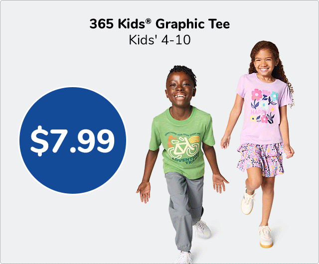
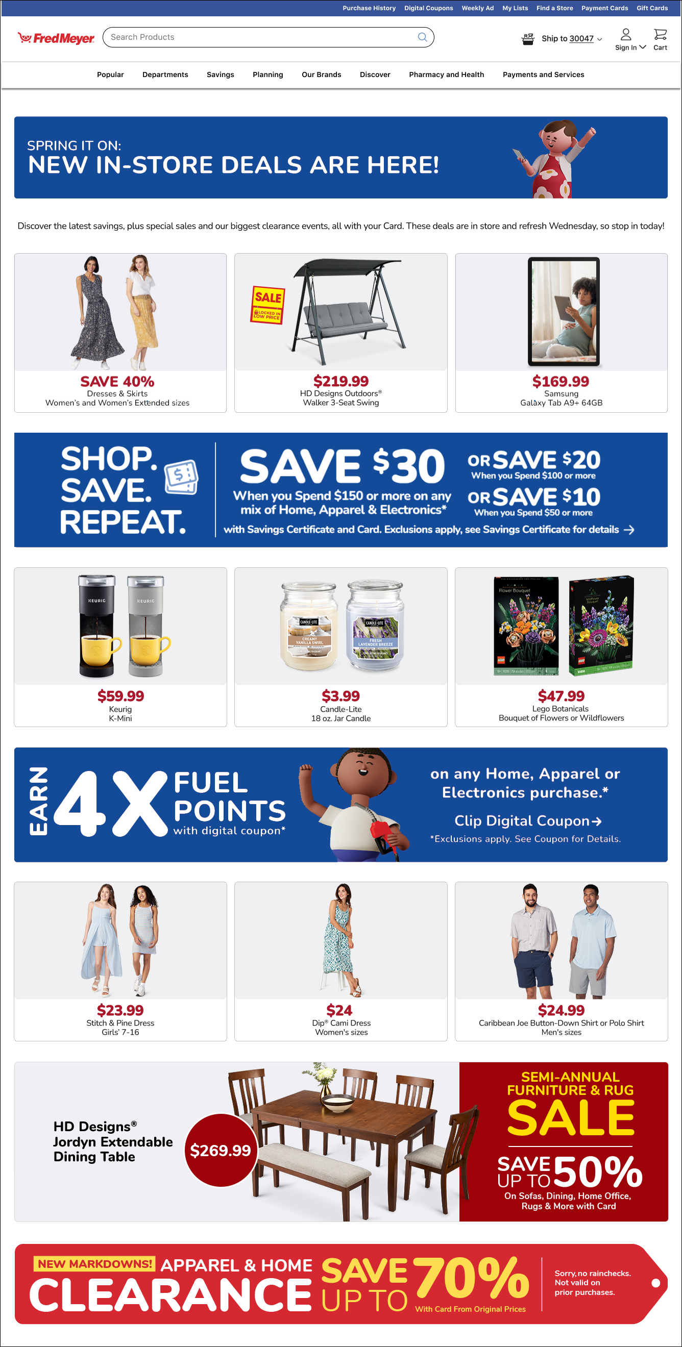
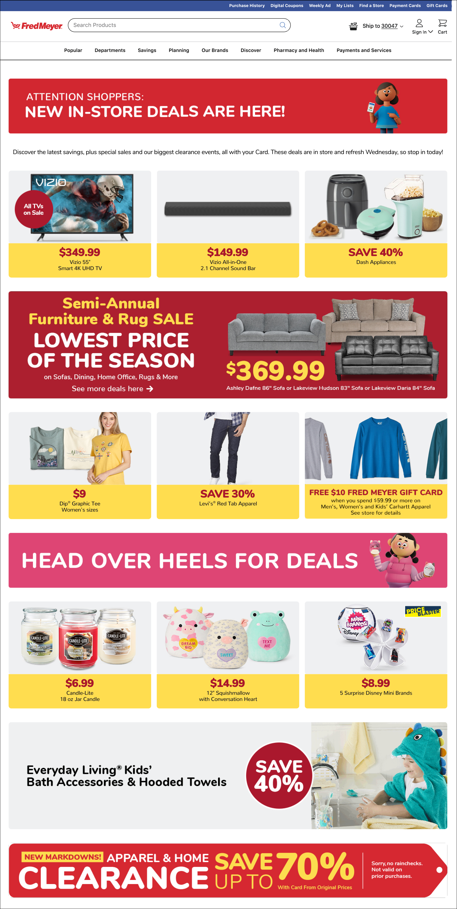
When reviewing the landing page, we identified key issues: a lack of visual hierarchy between the “triple heroes” banners and hero banners, inconsistent pricing design (e.g., bubbles, sizing), and low customer engagement with Espots.
Key solutions include: changing the yellow background of the product hero to white; establishing a consistent pricing system (using a consistent font size and use of superscript for dollar symbol when prices are too long); using either a single or two colors across the page for the promotional banners; and replacing the spacer header with a permanent 4X Fuel Points Banner. The fuel point banner increased WoW by 5% in one week, with a steady 1% increase in the weeks after.
Overview
Before
After
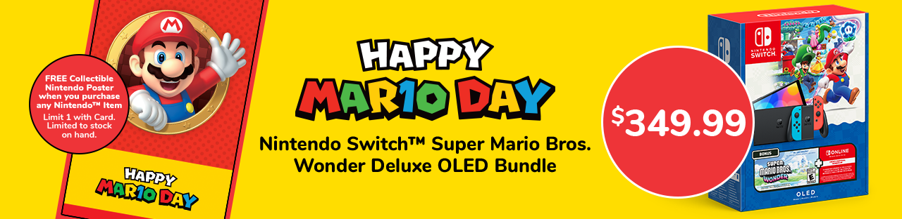
In addition to advertising merchandise from the corresponding weekly ad, Espots banners were used for promotional purposes and digital coupons.
Another way we increased customer engagement was by creating animated GIFs to showcase the product or promotion, either by using previously shot items or collaborating with our studio photographers.